How to Pick Paint Colors That Enhance Small Northern VA Rooms
Selecting the perfect paint colors for small rooms in Northern Virginia requires understanding how different hues interact with the region's unique lighting conditions and architectural styles. The right color choices can transform cramped spaces into inviting, airy environments that maximize both natural and artificial light. From the historic charm of Old Town Alexandria to the modern townhomes of Fairfax County, Northern Virginia homeowners face the challenge of making compact living spaces feel larger and more comfortable.
Whether you're updating a cozy Arlington condo or refreshing a small bedroom in Vienna, painting your interiors with strategically selected colors can dramatically impact how spacious and welcoming your rooms feel. This comprehensive guide will walk you through proven techniques for choosing colors that enhance your space, work with Northern Virginia's varying light patterns, and create the atmosphere you desire in every room of your home.
Key Takeaways
- Light colors reflect more light and create the illusion of larger spaces, making them ideal for small Northern Virginia rooms with limited natural light.
- Cool tones like soft blues and greens work exceptionally well in rooms facing south or west, where afternoon sun can make spaces feel warm and cramped.
- Creating monochromatic color schemes using different shades of the same color family helps eliminate visual boundaries and makes rooms appear more spacious.
- Strategic accent walls can add depth without overwhelming small spaces when painted in colors that are only slightly darker than the main wall color.
- Testing paint colors in different lighting conditions throughout the day is crucial in Northern Virginia due to varying seasonal light patterns.
- Coordinating paint colors with existing fixtures and furnishings creates cohesive design schemes that enhance rather than compete with your space.
Understanding Light in Northern Virginia Homes
Northern Virginia's geographic location creates unique lighting challenges that directly impact how paint colors appear in your home. The region experiences distinct seasonal variations, with winter months bringing softer, more diffused light through cloudy skies, while summer provides intense, direct sunlight that can dramatically alter color perception.
Many homes in areas like Leesburg, Ashburn, and Herndon feature smaller windows due to energy efficiency considerations and architectural trends. This reduced natural light makes it essential to choose paint colors that maximize brightness rather than absorb it. North-facing rooms receive consistent but cooler light throughout the day, making them ideal candidates for warm paint tones that add coziness without overwhelming the space.
The density of tree coverage in many Northern Virginia neighborhoods also affects indoor lighting. Mature oak and maple trees, while beautiful, can filter natural light and create greenish undertones that influence how paint colors appear on your walls. Understanding these environmental factors helps you make informed decisions about how to choose a paint color for a room that will look consistent and appealing year-round.
Homeowners planning updates with a
remodeling contractor in Leesburg, VA should consider how natural light, room orientation, and existing finishes affect paint color choices.
The Psychology of Color in Small Spaces
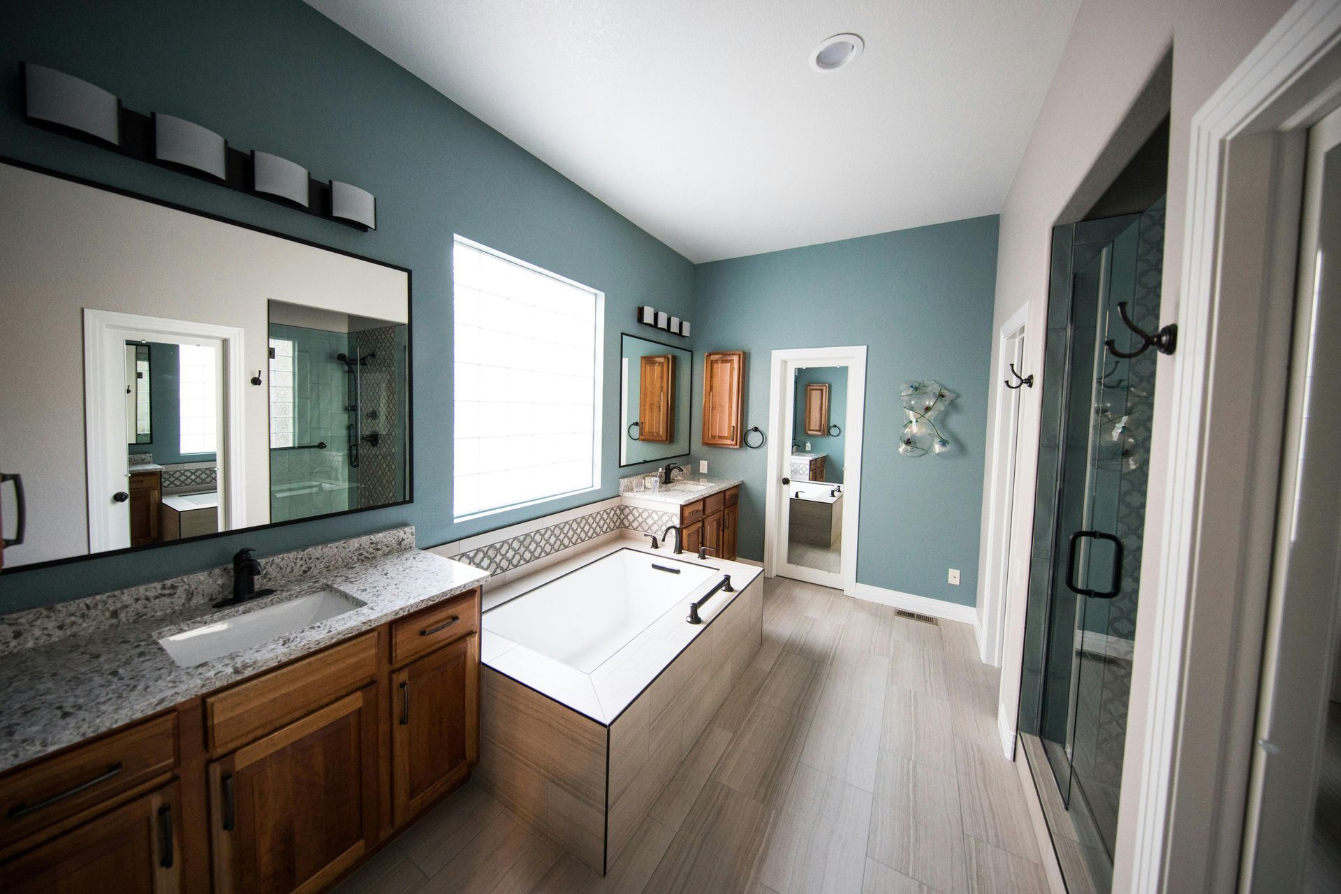
Color psychology plays a crucial role in how we perceive space and comfort within our homes. Light, neutral colors create an immediate sense of openness by reflecting available light and creating visual continuity between walls, ceilings, and floors. This effect is particularly important when learning how to pick interior paint color for compact bedrooms, bathrooms, and living areas common in Northern Virginia's urban communities.
Warm colors tend to advance visually, making walls appear closer and rooms feel smaller, while cool colors recede, creating the illusion of greater depth and space. However, this doesn't mean you should avoid warm tones entirely. Soft, muted warm colors like pale peach, cream, or light taupe can add comfort and intimacy to small spaces without making them feel cramped.
The key to successful color selection lies in understanding undertones. Many seemingly neutral colors have subtle undertones that become more apparent in different lighting conditions. For example, a gray paint might have blue, green, or purple undertones that only become obvious when natural light changes throughout the day. Professional color consultations can help identify these subtleties and ensure your chosen colors work harmoniously with your home's specific lighting conditions.
Best Paint Color Categories for Small Rooms
Light Neutrals and Whites
Light neutrals remain the most reliable choice for small spaces because they maximize light reflection and create seamless visual flow. Pure white can feel stark and cold, especially in rooms with limited natural light, so consider warmer whites with subtle cream or ivory undertones. These colors work particularly well in small kitchens and bathrooms where cleanliness and brightness are priorities.
Popular neutral options include soft grays, warm beiges, and gentle off-whites that complement both traditional and contemporary furnishings. When selecting neutrals, consider the existing elements in your room, such as flooring, countertops, and built-in features. The goal is to create a cohesive backdrop that allows your furniture and decorative elements to shine without competing for visual attention.
Soft Cool Tones
Pale blues, soft greens, and gentle lavenders can make small rooms feel more spacious while adding subtle color interest. These cool tones work especially well in bedrooms and bathrooms where a calming atmosphere is desired. When considering how to pick paint colors for bedroom spaces, these hues promote relaxation while maintaining the airy feel essential in compact sleeping areas.
Cool tones are particularly effective in rooms that receive abundant natural light, as they can help balance intense sunlight and prevent spaces from feeling overheated. However, be cautious with cool colors in north-facing rooms or spaces with limited natural light, as they can appear dull or unwelcoming without adequate illumination.
Monochromatic Schemes
Using varying shades of the same color family creates sophisticated, cohesive looks that eliminate visual boundaries between surfaces. This technique involves painting walls in a light base color, then using slightly deeper tones for trim work or accent features. The subtle variation adds depth and interest without creating the choppy, disconnected feeling that can make small rooms appear even smaller.
Monochromatic schemes work particularly well with gray, beige, or blue color families. For example, you might use a pale gray on walls with slightly darker gray trim and white ceiling, creating layers of color that feel intentional and sophisticated. This approach to picking room colors allows for creativity while maintaining the space-enhancing benefits of light, cohesive color palettes.
Room-Specific Color Strategies
Different rooms serve different purposes and therefore benefit from tailored color approaches. Living areas need colors that feel welcoming for entertaining while maintaining the open feel essential in small spaces. Bedrooms require calming tones that promote rest, while home offices need colors that enhance focus and productivity without feeling oppressive.
Kitchens in small Northern Virginia homes often serve multiple functions as dining and social spaces. Light, clean colors work best here, with the option to add personality through colorful backsplashes or accessories rather than wall paint. Bathrooms benefit from colors that feel fresh and clean while compensating for often limited natural light sources.
When determining how to choose paint for walls in multi-purpose rooms, consider the primary function while ensuring colors transition smoothly between adjacent spaces. Open floor plans common in modern Northern Virginia homes require special attention to color flow, as abrupt color changes can create visual barriers that make spaces feel smaller and more fragmented.
Testing and Sampling Paint Colors
Never rely solely on paint chips or digital samples when making final color decisions. Paint samples on large poster boards or directly on walls in multiple locations throughout the room. Observe how colors change throughout the day, noting differences in morning light versus afternoon and evening illumination. This process is particularly important in Northern Virginia, where seasonal light variations can significantly impact color appearance.
Test colors on both north and south-facing walls if possible, as the quality and direction of light will affect how the same color appears. Many homeowners are surprised to discover that colors that look perfect in bright afternoon light can appear completely different in the soft morning light or under artificial evening lighting.
Professional color consultations can provide valuable insights into how specific colors will perform in your unique space. Experienced painters and color specialists understand the nuances of how different paint formulations and finishes interact with various lighting conditions, helping you avoid costly mistakes and achieve the exact look you envision for your home.
Proven Color Combinations for Small Spaces
| Color Scheme | Best For | Key Benefits |
|---|---|---|
| Soft white walls with gray trim | Living rooms, dining areas | Maximum light reflection, timeless appeal |
| Pale blue walls with white ceiling | Bedrooms, bathrooms | Calming effect, space-enhancing |
| Warm beige with cream accents | North-facing rooms | Adds warmth to cool natural light |
| Light gray with white trim | Home offices, modern spaces | Contemporary appeal, versatile backdrop |
These proven combinations work well in Northern Virginia's diverse housing stock, from colonial-style homes in McLean to contemporary condos in Arlington. The key is selecting combinations that complement your existing architectural features while maximizing the sense of space and light in compact rooms.
Common Mistakes to Avoid When Picking Room Colors
One of the most frequent mistakes homeowners make is choosing colors based solely on what looks appealing in magazines or showrooms. Colors that work beautifully in large, well-lit spaces can appear dramatically different in smaller rooms with limited natural light. Always test potential colors in your specific space before making final decisions.
Avoiding bold, dark colors entirely is another common misconception. While dark colors should be used carefully in small spaces, rich accent walls or deep trim colors can actually add sophistication and depth when used strategically. The key is using dark colors sparingly and in combination with lighter shades that maintain the room's airy feel.
Failing to consider the room's existing elements is a costly mistake that can result in clashing colors and an uncoordinated appearance. When learning how to pick interior paint, always account for permanent fixtures like flooring, countertops, and built-in cabinetry. These elements should inform your color choices rather than compete with them.
Ignoring paint finish is another oversight that can impact both appearance and functionality. Higher sheen finishes reflect more light and can help brighten small spaces, but they also highlight wall imperfections. Semi-gloss works well in bathrooms and kitchens where moisture resistance is important, while eggshell or satin finishes provide a good balance for living areas and bedrooms.
Frequently Asked Questions
Should I paint my small room's ceiling the same color as the walls?
Painting the ceiling the same color as the walls can make a small room feel larger by eliminating visual boundaries and creating seamless flow. This technique works particularly well with light, neutral colors that reflect maximum light throughout the space.
How do I choose colors that will work year-round in Northern Virginia's changing light?
Test paint samples during different seasons and times of day to ensure consistent appeal throughout the year. Choose colors with balanced undertones that won't shift dramatically as natural light changes from summer's bright intensity to winter's softer tones.
Can I use accent walls in small rooms without making them feel smaller?
Yes, but choose colors that are only slightly deeper than your main wall color rather than dramatically contrasting hues. Position accent walls on surfaces that naturally recede, such as the wall opposite the main entrance or behind a bed in a bedroom.
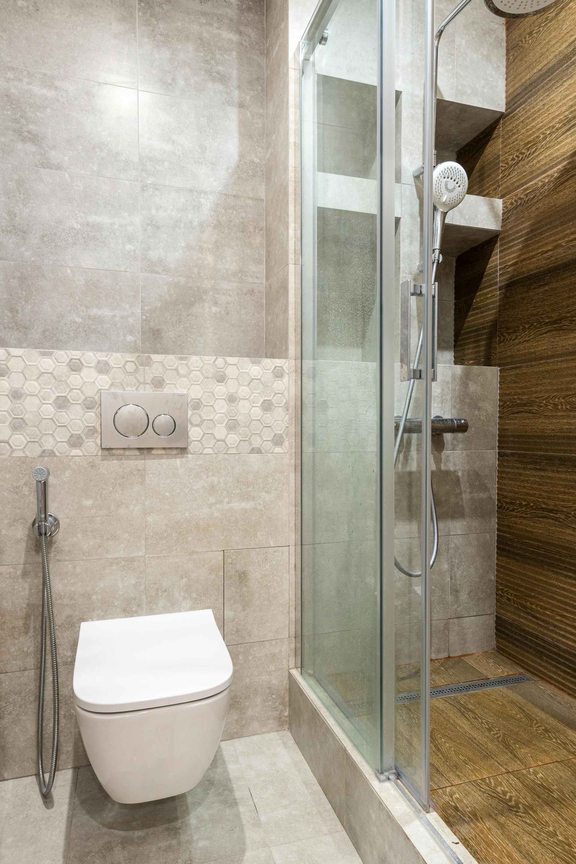
What paint colors work best in small Northern Virginia bathrooms with no windows?
Light, cool colors like pale blues or soft greens can make windowless bathrooms feel fresh and airy. Complement these colors with excellent artificial lighting and consider semi-gloss or satin finishes that reflect light and resist moisture.
How can I coordinate paint colors between connected small rooms in an open floor plan?
Use a consistent color family with slight variations in intensity rather than completely different colors. This approach maintains visual flow while allowing each area to have its own subtle identity within the larger connected space.
Final Thoughts
Successfully picking room colors for small Northern Virginia homes requires balancing practical considerations with personal style preferences. The region's unique lighting conditions, seasonal variations, and diverse architectural styles all influence how colors appear and feel in your living spaces. By understanding these factors and following proven color selection strategies, you can transform even the most compact rooms into welcoming, spacious-feeling environments.
Remember that color selection is just one element of creating beautiful, functional living spaces. Professional interior painting services can ensure your chosen colors are applied with the expertise and attention to detail that maximizes their impact. Whether you're planning a complete home renovation or simply refreshing a single room, the right paint colors provide the foundation for spaces you'll love living in for years to come.
Ready to transform your space? Contact our Northern Virginia painting experts for a personalized color consultation today.
Reference:
https://www.swatchbox.com/blog/The-Psychology-of-Color-in-Interior-Design